
Shpock is a classifieds marketplace platform focused on the UK market, with more than 10 million active users. I was lucky enough to be part the team quite early on and even though there were lots of challenges and growing pains it was really useful for me to be able to experience first hand all the different stages a company must go through as it develops.
One of the big milestones was building a transactional model. Shpock was inherently focused on showcasing second hand items based on user location and meeting in person to exchange money and goods was very common. But it proved really hard to monetise this kind of business model.
Also we were getting a lot of complaints about scammers because we had no control over the process. Understanding this was both a company goal and the user need pushed Shpock to start developing a new model where people would pay online and get items delivered to their home. This meant radically changing the user experience by giving users the possibility to find and buy second hand items without worrying about how far away they are.
We created a multifunctional team tasked with finding a solution and I was the designer assigned to that team.
I find that like any creative process the path to discovering the right solution can become quite hectic at times and for this reason it’s important to have a structured approach to help keep things organised.
Here is my approach:

Of course in reality this is not linear, it requires a mindset of exploration. But even explorers need a compass, we need guidance, and our compass should be the feedback we gather for our users. Understanding the problem through the eyes of our customers and developing empathy for their challenges will help us come up with better solutions.
So rather than looking at these as consecutive steps I see this process as a diagram of tools I can use:
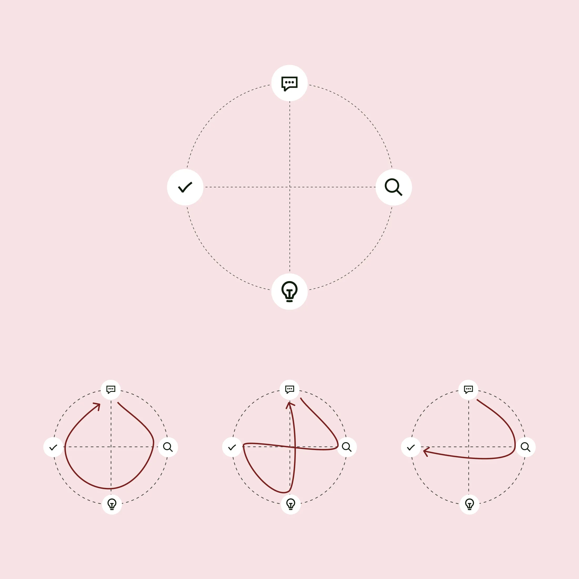

At this point we consider opportunities in the whole user journey. Every opportunity should be based on a user problem, need or desire.
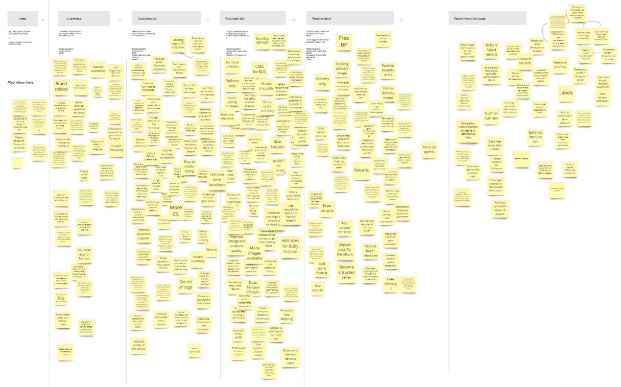
In this case I used this funnel to help break down the different areas of a user journey:
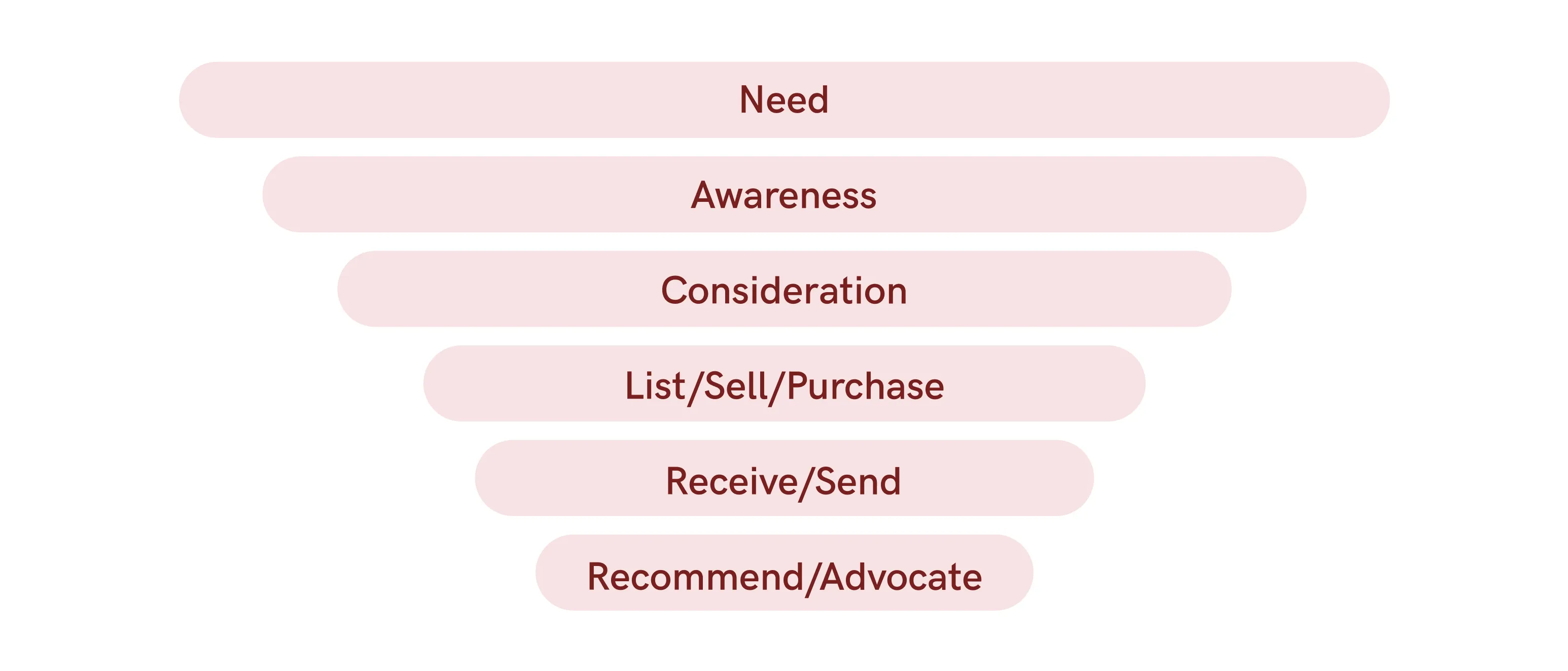
Objective:
Make Shpock a trusted transactional marketplace where users can easily find good quality products.

Taking the time to gather data, explore opportunities and understand user needs is essential in this step.
Assumptions can be fatal because you don’t know when you are making them so I try to use all the information I can gathered through research to better understand the problem and reduce cognitive bias.
Problem:
It’s hard for users to find good quality transactional items. They need to go through lots of irrelevant search results to be able to find what they are looking for.

At this point I try to involve as many people as I can. Ideation sessions with key stakeholders can be very helpful as different people from different areas of the company can bring very valuable insights that might otherwise be overlooked.
Problem:
It’s hard for users to find good quality transactional items. They need to go trough lots of irrelevant search results to be able to find what they are looking for.
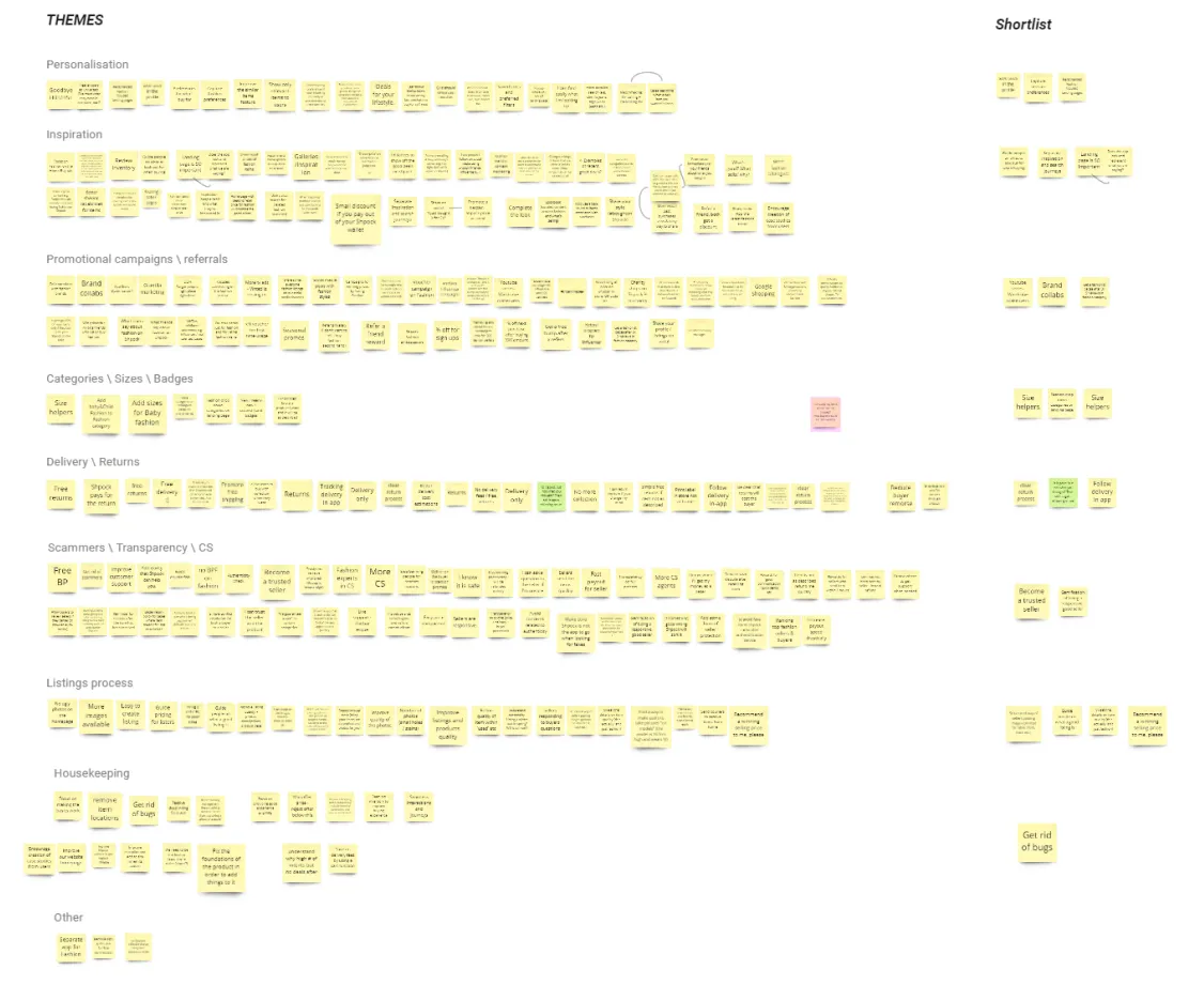
Hypotheses:
If we personalize the experience and create recommendations based on past user behavior we can increase the number of transactional deals by curating selections of quality items that will help users find what they are looking for.

Because by now I already have a lot of discovery work behind me and I can see some main trends forming I can be more confident when validating ideas.
The trick is to validate our ideas as fast and as cheaply as possible. It is better to fail and learn than learn nothing at all.
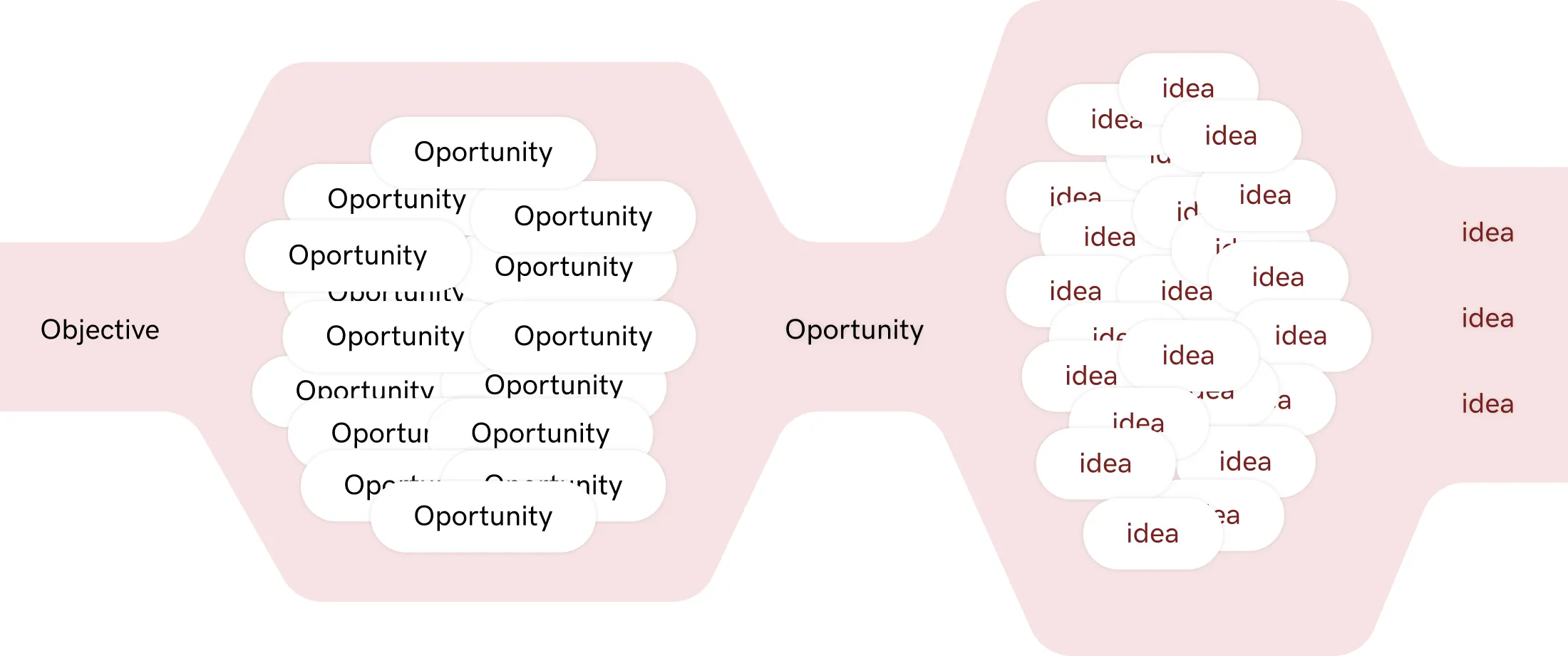
Opportunity tree:
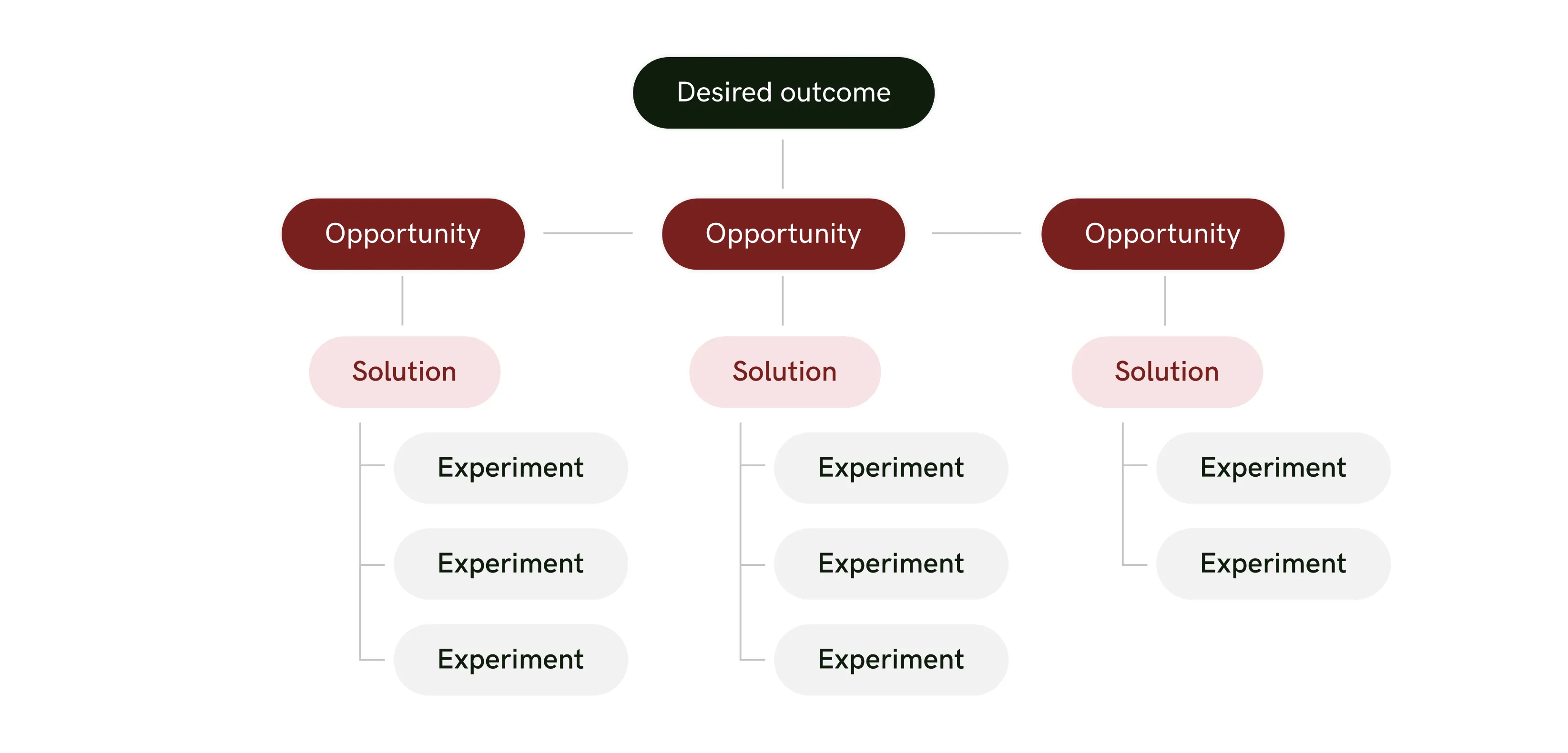
As shown in this opportunity tree diagram I use a series of so-called “experiments” to test out and validate hypotheses. These will vary depending on what we are trying to validate and they range from user testing, user interviews to in-app A-B testing and gradual staged releases.
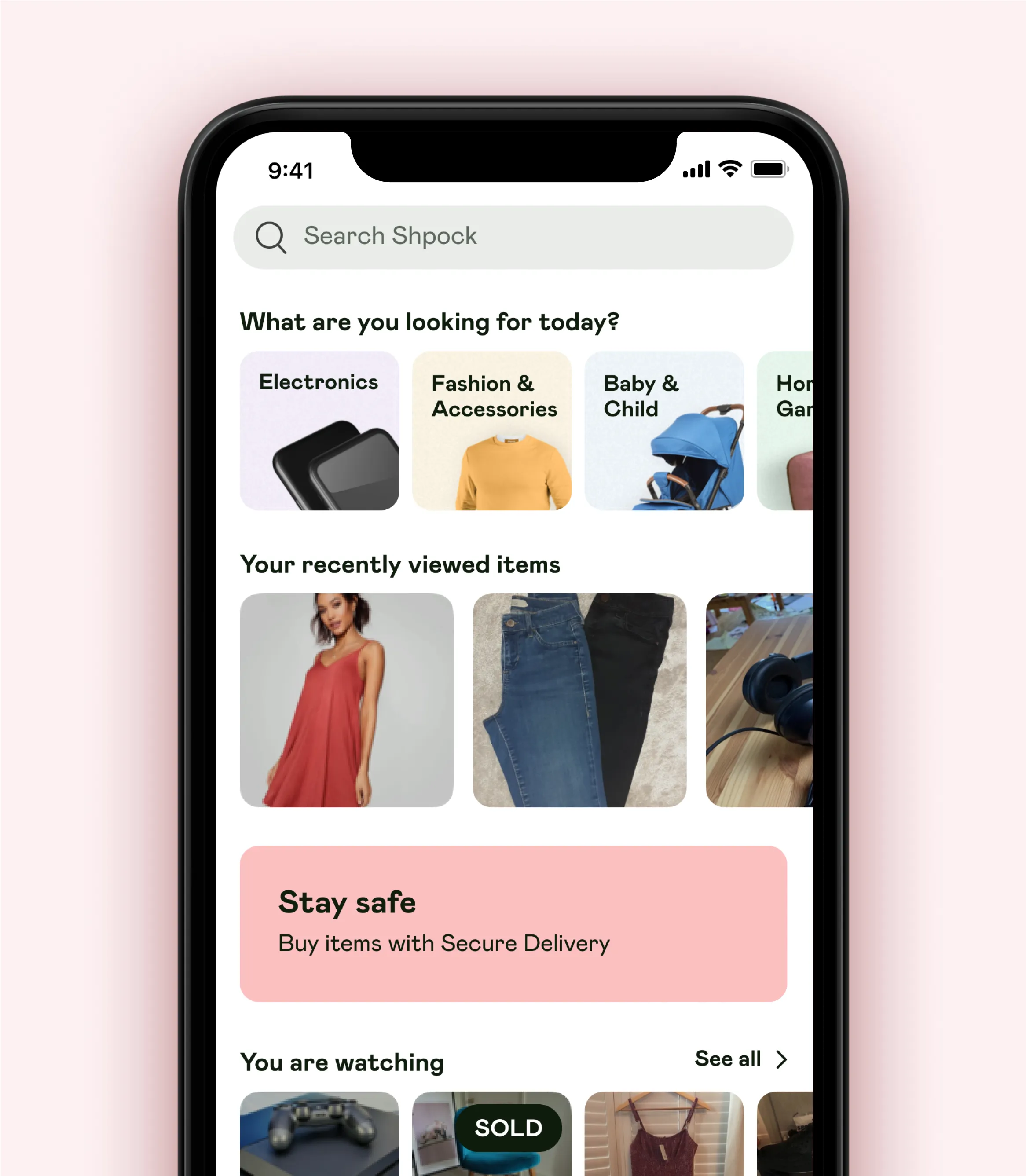
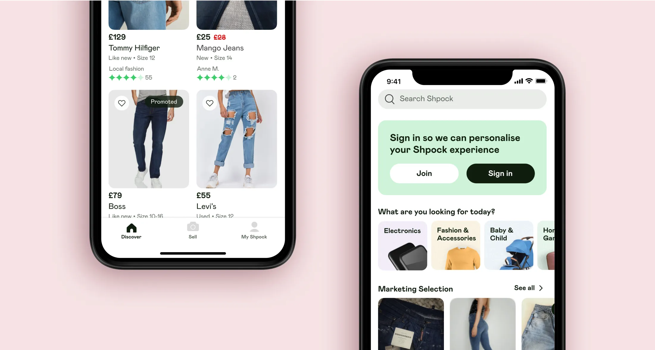
Next, I started mocking up and testing wireframes reflecting our long-term vision? Trying to put together a concept that would serve as our target. This was not meant to be a polished solution by any means but instead, its purpose was to help us have a better understanding of what we think the ideal scenario could look like.
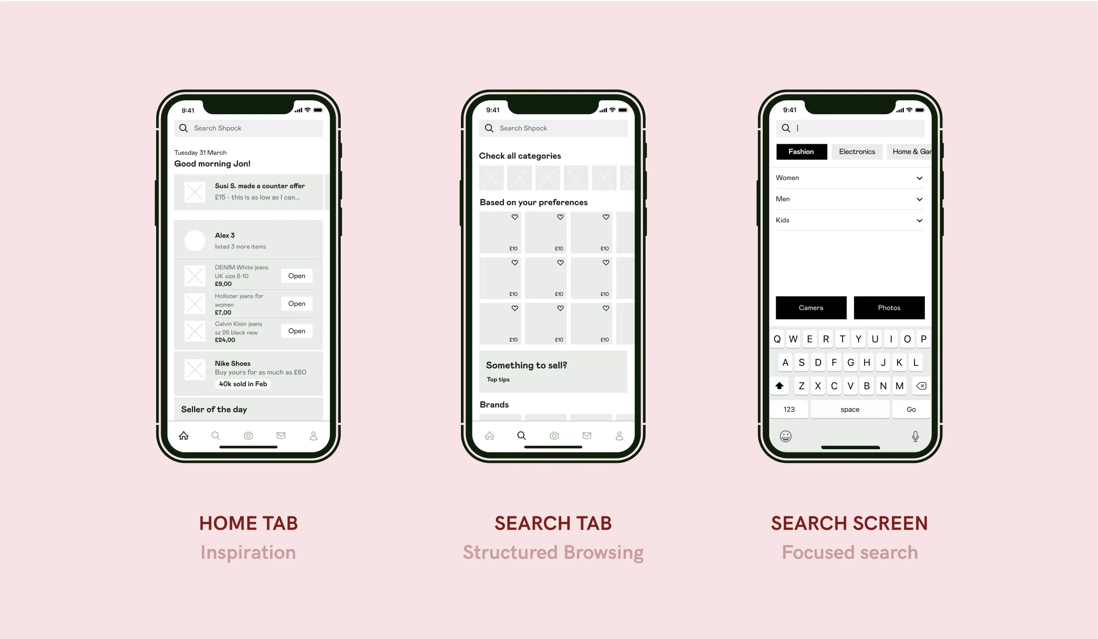
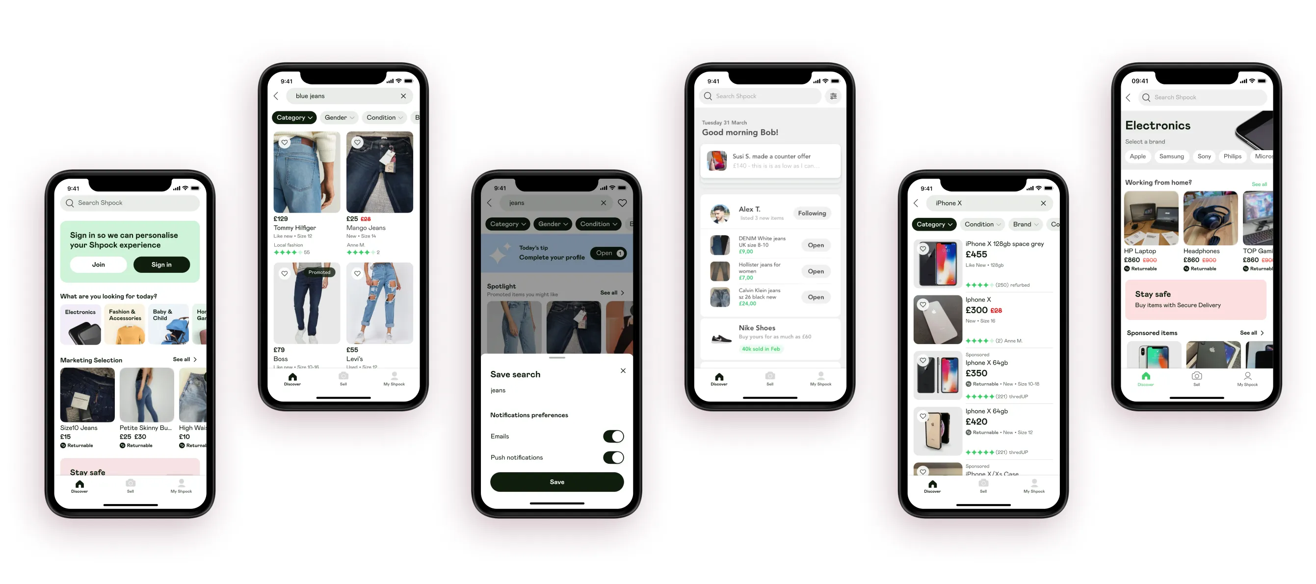
After testing multiple versions and ideas, the solution I ended up with was composed of 3 different user journeys as seen on top:
Inspiration - meant to drive future user behaiviour by showcasing promotions, sellers, shops, selections
Structured Browsing - a customized experience based on past user behaviour
Focused search - once the user taps on the search bar.
meant to help narrow down the search and make it less likely to get irrelevant results.
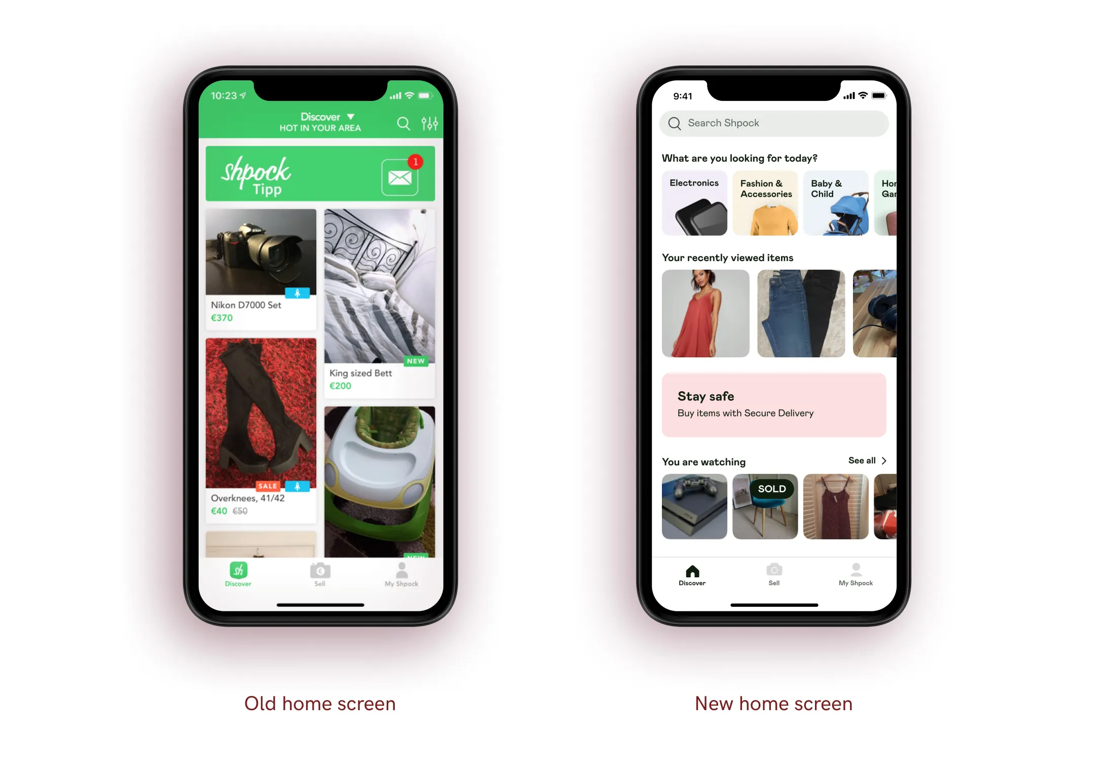
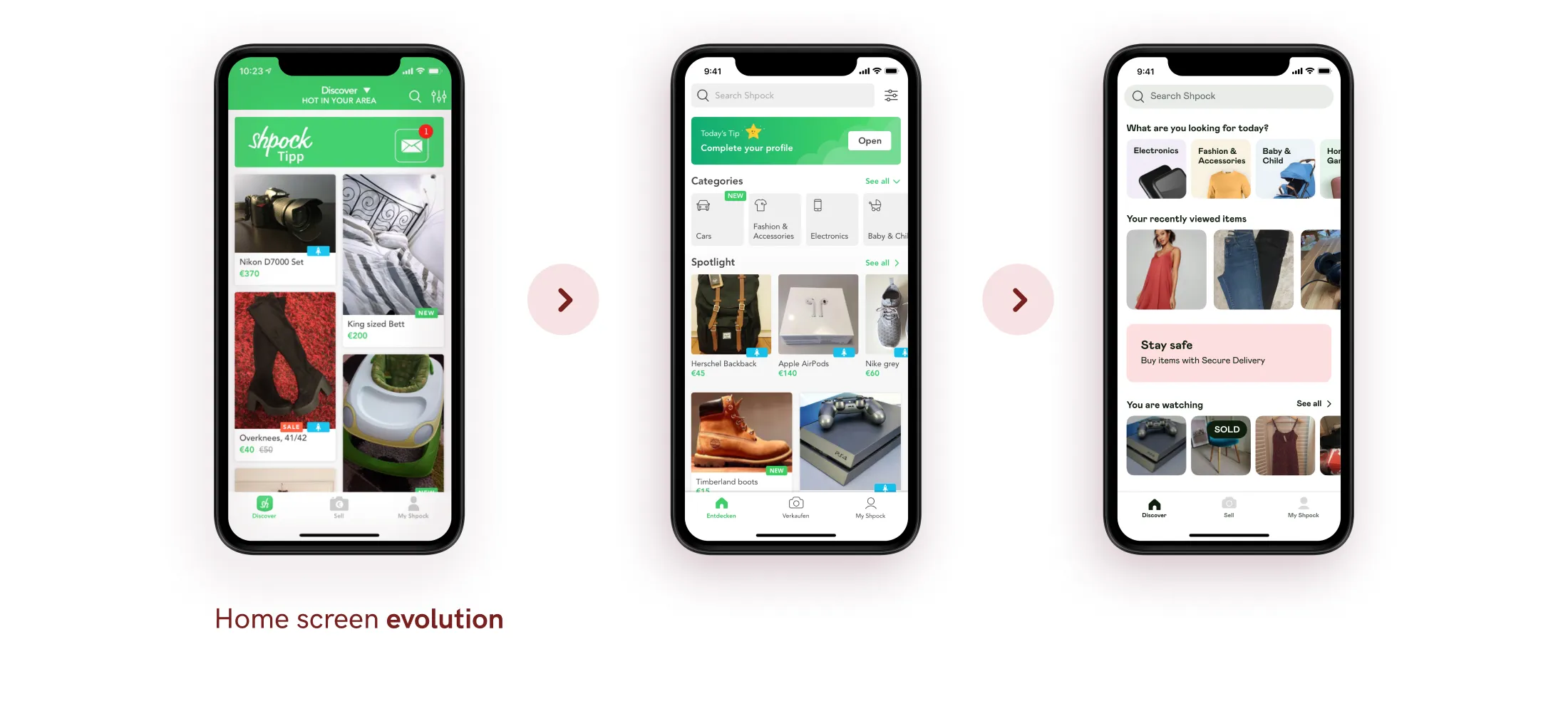
Having our ambitious long-term vision in place we needed to deal with a lot of tech debt so we planned a staged release. Together with the developers, I started creating the components needed for every phase. This would enable us to start learning and gathering data early in the development process and adapt our solution accordingly.
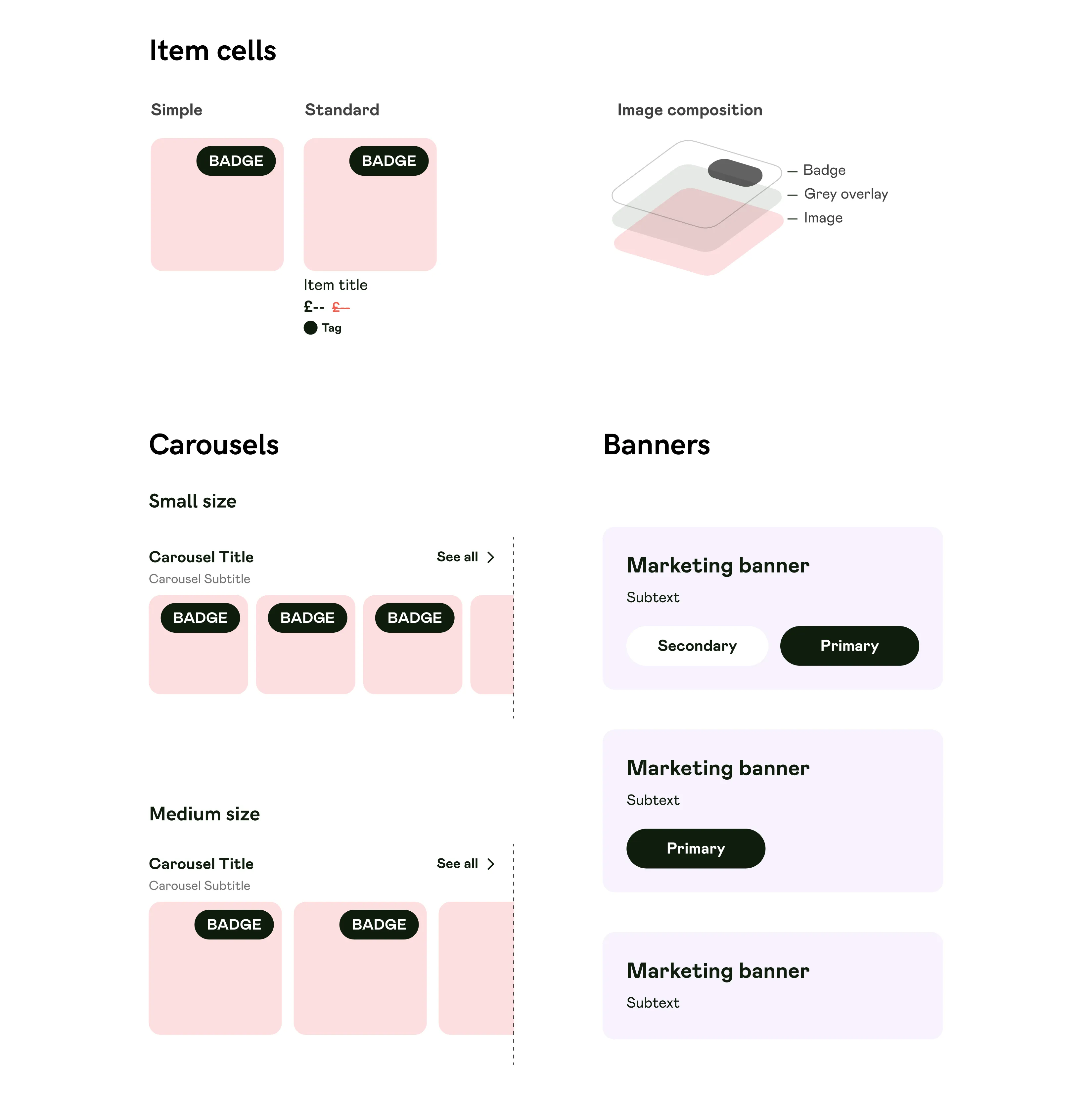
Aside from the carousel components, our main way of displaying items is the grid views. Inherently this was an infinite scrolling screen composed of 2 colors with item cells. The size of the item cells depended on the size of the item image. This made the grid very irregular and hard to follow.
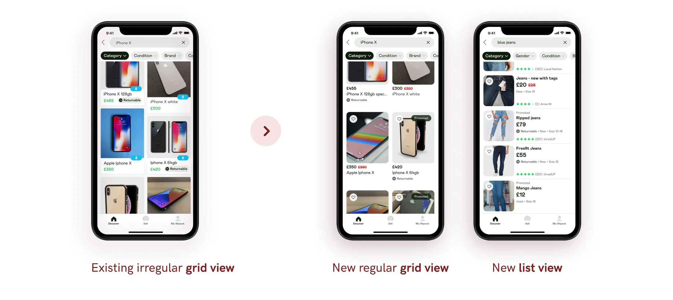
After testing multiple versions we ended up with 2 versions that performed best:
1. Regular grid view - 2 columns where all cells have the same size (height)
2. List view - 1 column list with the item images on the left and the information on the right.
We noticed that depending on what they were searching for users prefer one or the other. For example in the case of “Fashion” the grid view was best but for “Electronics” the list view was the winner.
By learning from the current implementation we can have a more data driven approach as we iterate and build on this foundation.
This was the biggest project I worked on at Shpock. It proved to me once again that the process is just as important as the outcome.
