
During my time at Shpock we’ve tried multiple times to develop and implement an overarching design system that would help keep everything nice and consistent. But as is the case with this kind of projects in smaller companies it was never our main focus, rather it was seen as a “nice to have” or a side project at best. For this reason it always ended up somewhere in the backlog. And even though we were building a few reusable components here and there, the structure or the backbone was missing.
With this in mind and being frustrated, around one year ago, I took the initiative to coordinate the work needed to rebuild our design system based on a set well defined principles and requirements.
Together with the rest of the design team, we started doing workshops and ideation sessions trying to understand what are the core principles we want to build our product on.
And this is what we ended up with:
Have fun and carry on. Clear, transparent, and spark joy in meaningful moments by understanding sellers and buyers, their objectives, and helping them accomplish them.
Polished
Carefully and beautifully crafted designs (experiences) along with thoughtful transitions, snappy animations make for a joyful experience.
Contextual
Design should reinforce the meaning of content, not distract from it.
Honest
We should be transparent with our customers in order to make them feel safe. We build trust with our customers by delivering on their expectations
Accessible to all
Our product should welcome the widest possible audience, free of obstacles.
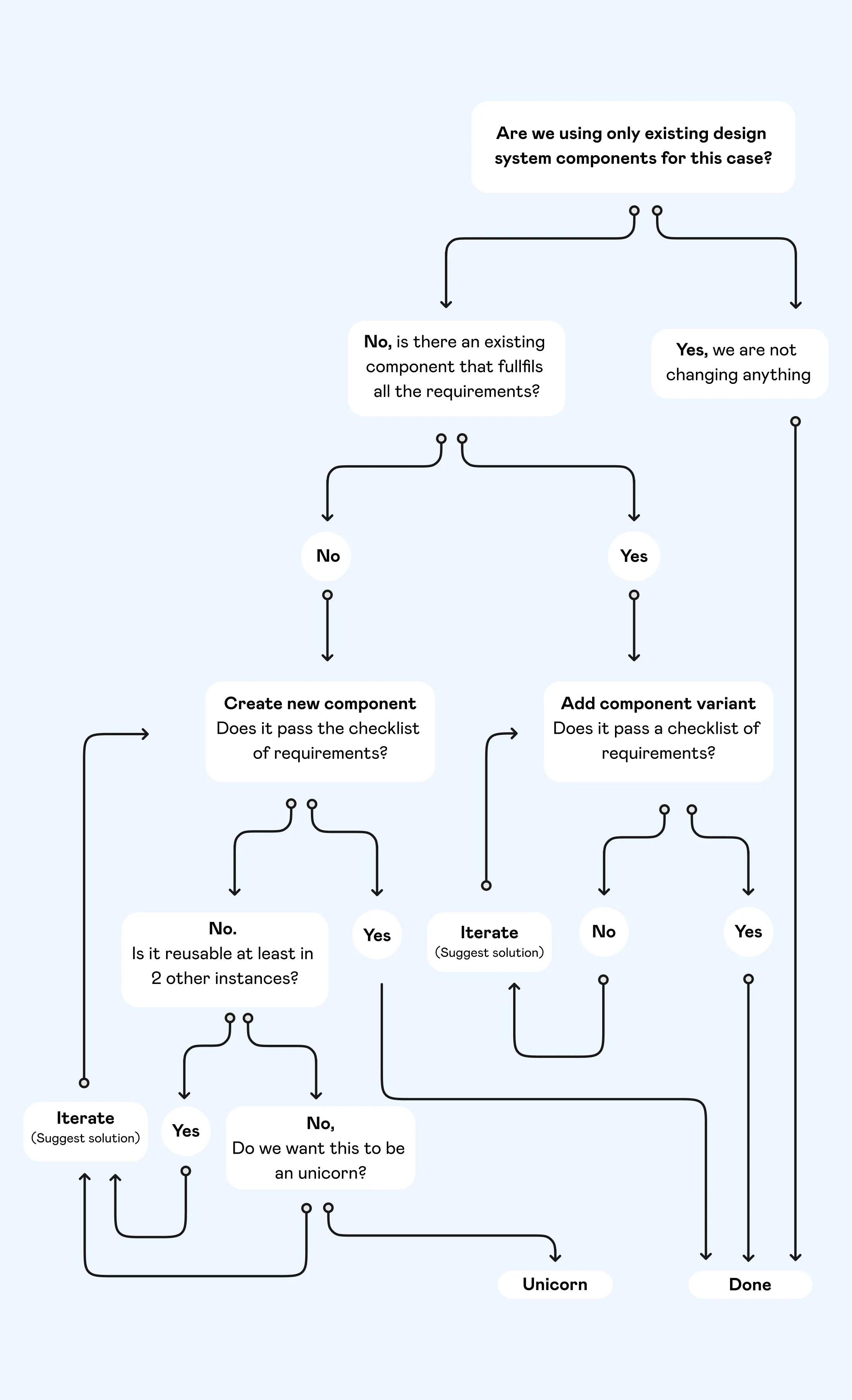
Based on these designs principles we came up with a set of rule and requirements that each component had to fulfil in order to be included in our design system. For every requirement we had at least one question meant to help drive our discussions and give us a better understanding of what that requirement impies.
1. Reusable
What instances can this component be used in?
2. Intuitive
What does this component look like across other platforms?
Do users feel they can interact with them?
Does it communicate the status? (What does this mean)
3. Consistent
What are the tokens, atoms, molecules that make up this component?
Do the tokens, atoms, molecules being used have specific usage rules?
4. Well defined
What problem is this component looking to solve?
Why don’t other components solve this problem?
If this is interactive, what are the different states?
How does it look on iOS / Android / Web?
How does it work with lots of copy and not much copy across different screen sizes?
Are there different component configurations?
Upon interaction, does it have different states?
5. Easy to use
Does the component have a minimum of AA colour contrast?
If the element is interactive, does it have a minimum tappable area of 44px?
Creating a new comprehensive end to end design system is always an interesting expercise, we like to
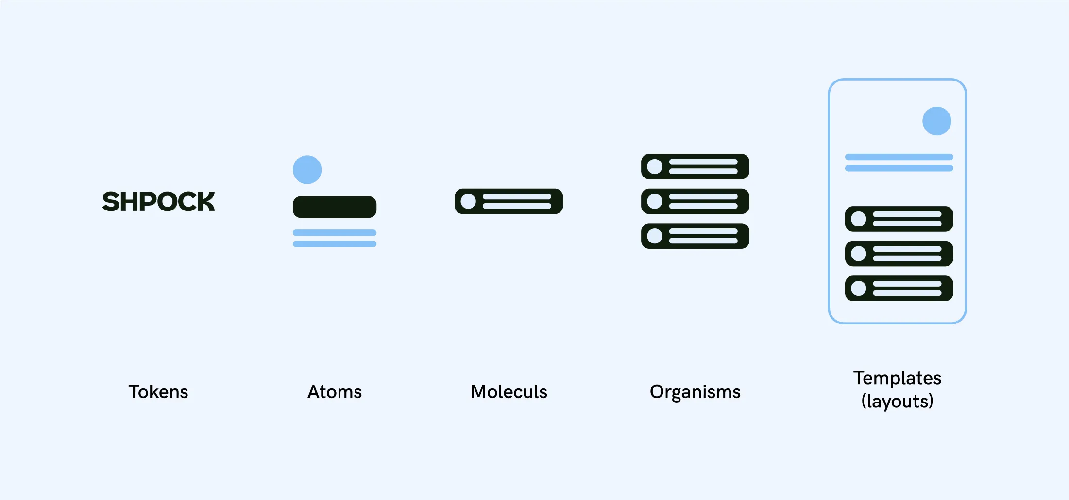
Tokens
Abstract, intangible design guidelines that can be applied to
atoms and molecules.
Atoms
Smallest, most basic elements that can survive on it’s own. They can’t be broken down further without losing their meaning.
Molecules
A collection of atoms. Each atom could be broken out of the molecule and still work on it’s own.
Organisms
Collection of molecules
Templates (layouts)
Collection of Molecules, Organisms and Atoms

You can have a comprehensive design system that contains a slew of well-structured components, thorough documentation, thoughtful guidelines, and a well-considered design language. But if a design system user can’t get done what they’re trying to get done, the whole system risks obsolescence.
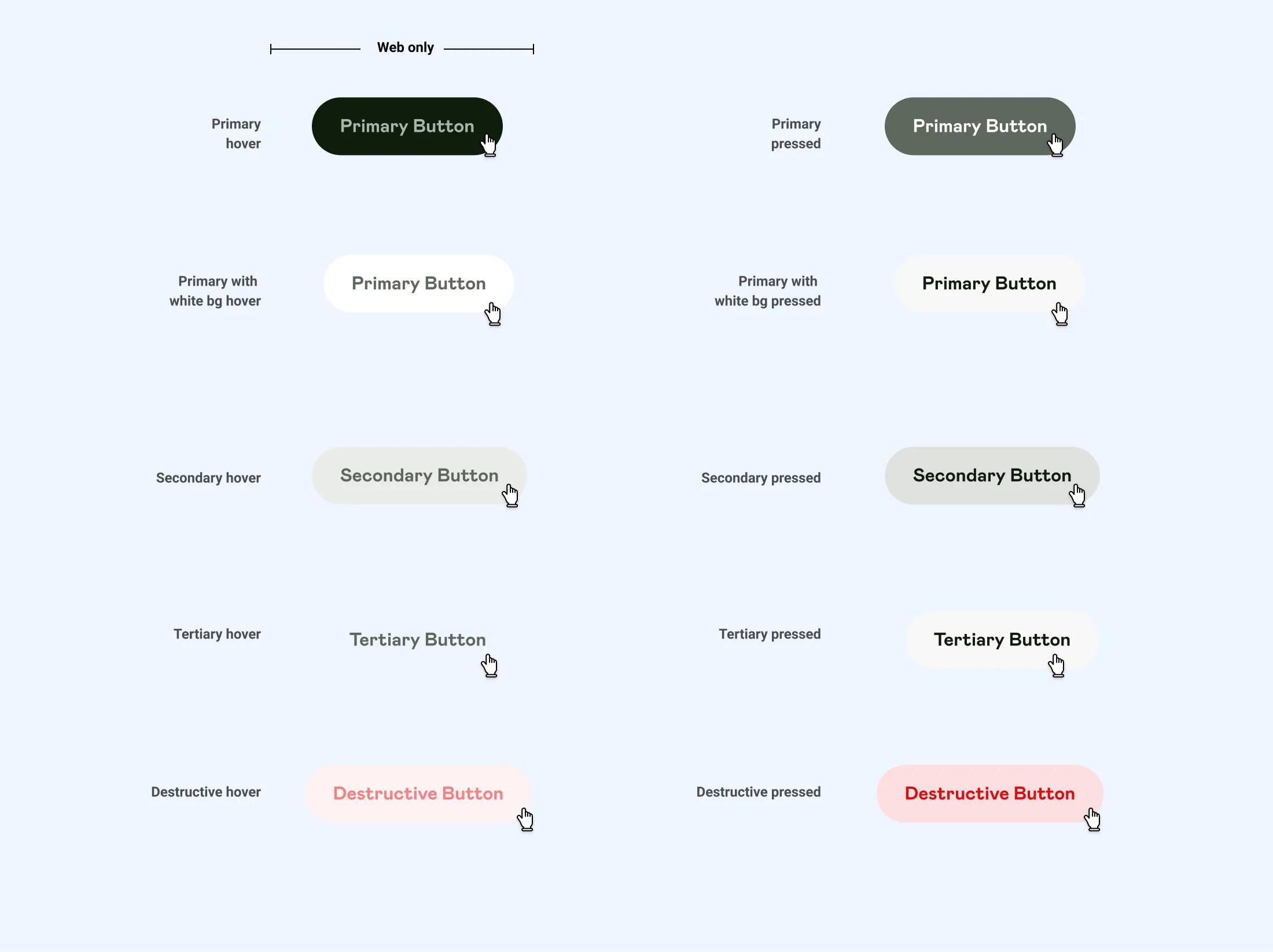
One of the most important as well as basic building blocks of a design system is CsTA. They are the main way users interact with our interface so it’s no wonder that they are the subject of many opinionated discussions.
Using this structure helped create intuitive, reusable, consistent, well-defined components like this:
Medium (default size)

Medium (default size)
We decided to build a new icon set to reflect our new visual style.
As shown in the video above, when creating the new icons set, transitions, interactions and overall behavior played a very important role in building these icons from the ground up with the goal of making our interface more joyful and intuitive.
