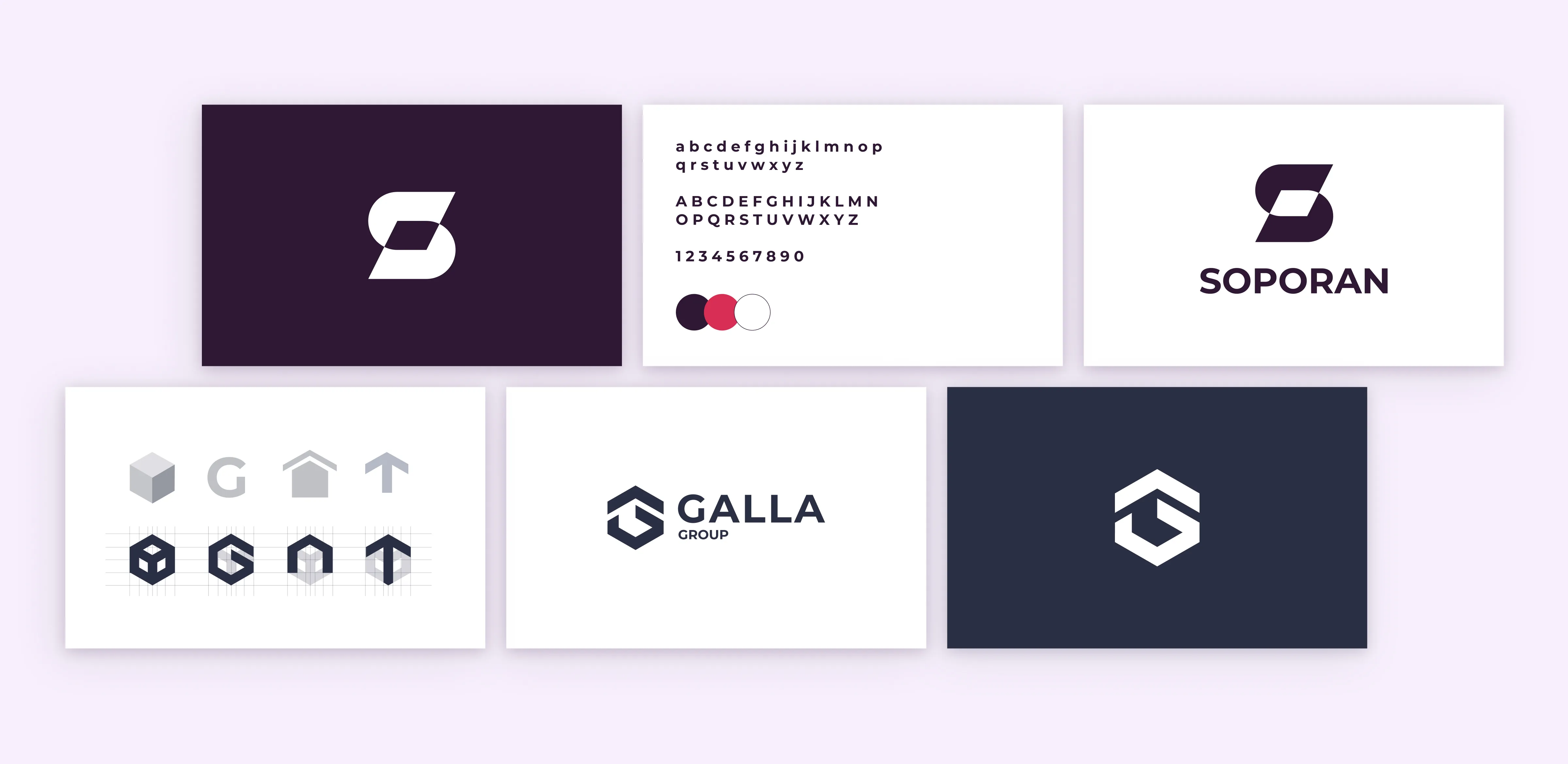
This is a small company just outside Vienna that specializes in flat roof waterproofing. They were starting to work with bigger clients and needed a coherent branding strategy as well as a profesional up to date visual language.
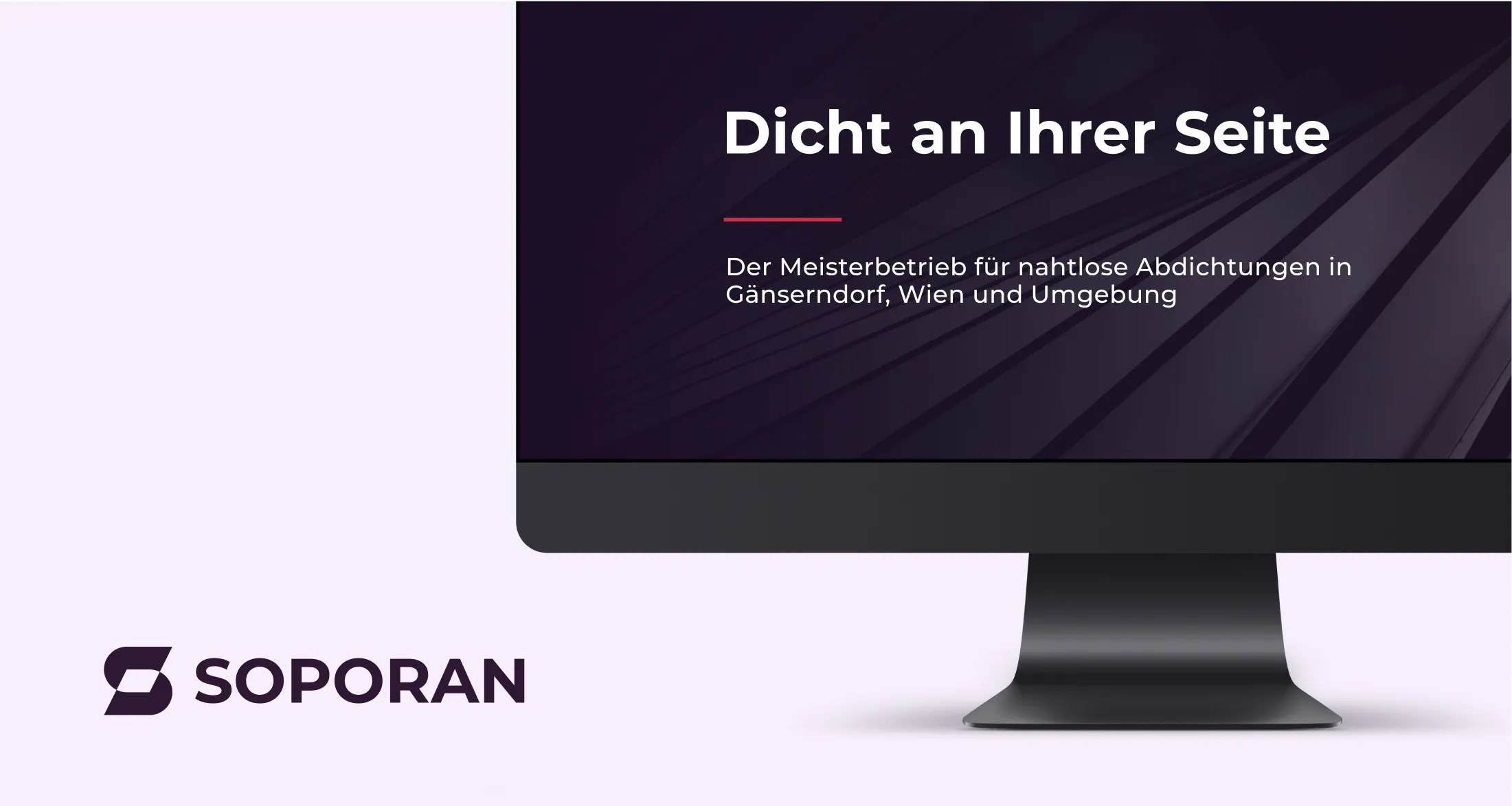
Starting with the colours all the way to the shape of the logo and the imagery I took a lot of inspiration from the construction sites that they are working on. The cylindrical insulation roll, the flame that helps apply it to the roof and the dak colour of the pitch were all styelised and applied to the new visual language.

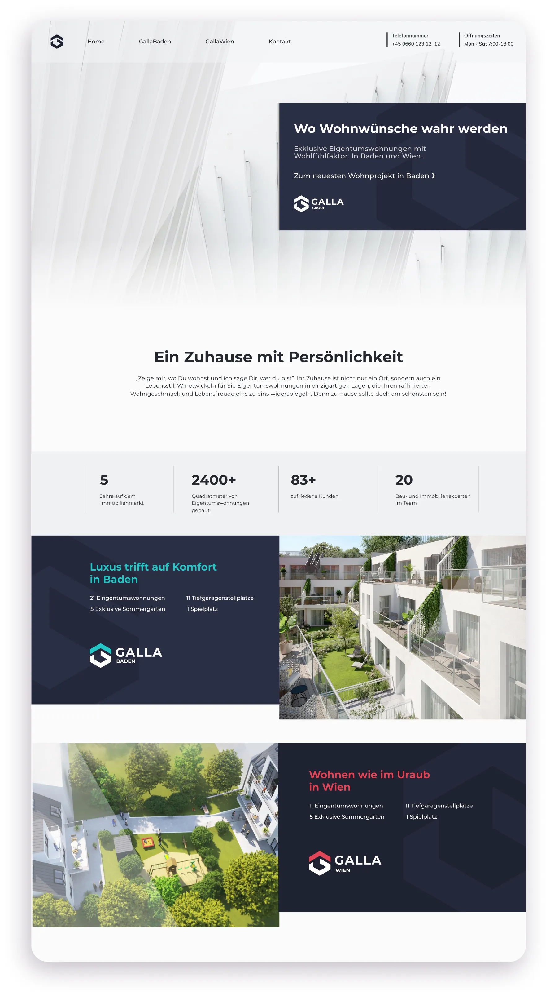
A medium-size real estate developer based in Vienna came to me with a request to create a logo for their company that was flexible enough to use for all their different projects. After talking to them I realized they needed a new long-term strategy that would build up their brand as a trustworthy and successful company.
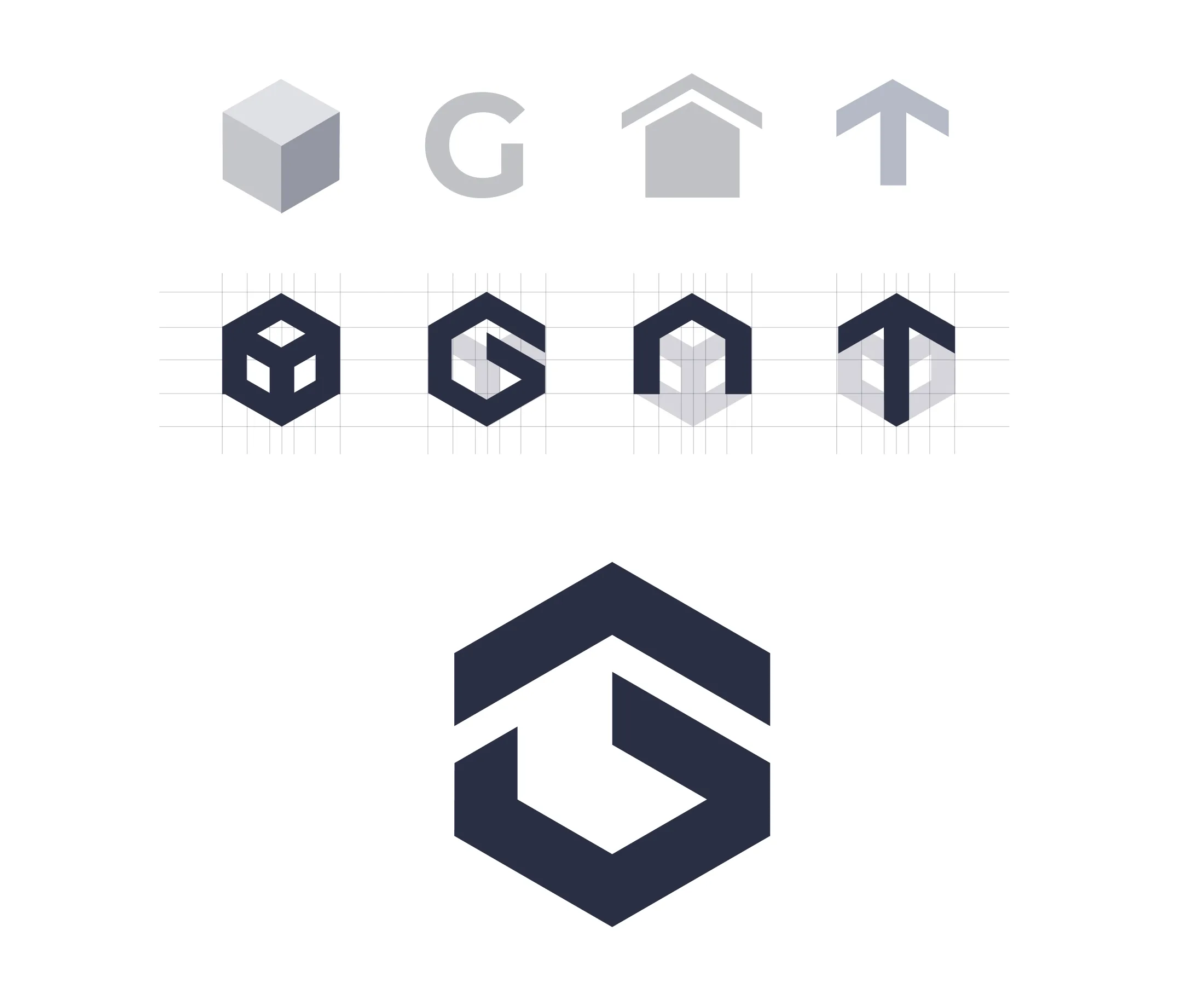
When working on the logo I started off with very simple geometric shapes resembling a 3D building in combination with the letter G, arrow up (growth), and the home icon. Using a very common way of representing 3D objects in architecture the isometric axonometry I combined these shapes to get a meaningful, personalized, and easily recognizable logo that would allow for lots of flexibility by changing the colors and even the shapes within the constraints set by this isometric axonometry representation.
The visual language used for the website needed to work together with the logo to create multiple landing pages for all the different projects while keeping a consistent overarching look and feel that was easily indefinisabile.
